
Notice
Recent Posts
Recent Comments
Link
| 일 | 월 | 화 | 수 | 목 | 금 | 토 |
|---|---|---|---|---|---|---|
| 1 | 2 | 3 | ||||
| 4 | 5 | 6 | 7 | 8 | 9 | 10 |
| 11 | 12 | 13 | 14 | 15 | 16 | 17 |
| 18 | 19 | 20 | 21 | 22 | 23 | 24 |
| 25 | 26 | 27 | 28 | 29 | 30 | 31 |
Tags
- MATLAB
- Visualization
- SQL
- Tistory
- 월간결산
- 티스토리
- Google Analytics
- 매틀랩
- Ga
- 텐서플로
- 시각화
- Pandas
- 리눅스
- 파이썬
- matplotlib
- 서평단
- 한빛미디어
- 파이썬 시각화
- 딥러닝
- Python
- 서평
- 독후감
- Blog
- MySQL
- 한빛미디어서평단
- 블로그
- Linux
- python visualization
- 통계학
- tensorflow
Archives
- Today
- Total
pbj0812의 코딩 일기
[PYTHON] GridSpec 을 이용한 여러 그래프를 같이 그리기 본문
0. 목표
- GridSpec 을 이용한 여러 그래프를 같이 그리기
1. 실습
1) library 호출
import seaborn as sns
import matplotlib.pyplot as plt
from matplotlib import gridspec
2) 데이터 생성
flights_long = sns.load_dataset("flights")3) heatmap 용 데이터
flights = flights_long.pivot("month", "year", "passengers")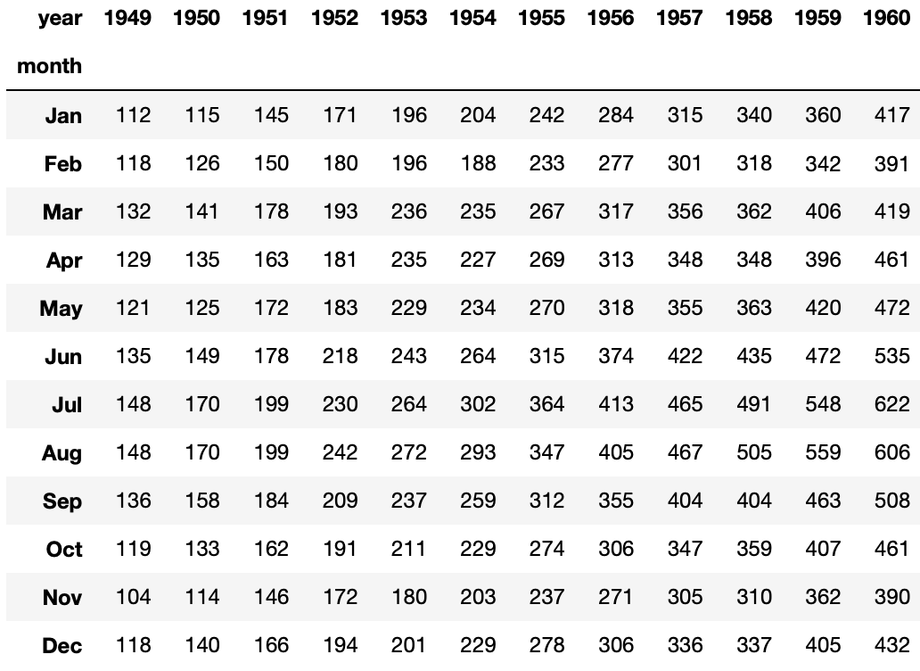
4) barplot 용 데이터
year_df = flights_long.groupby(by = 'year').agg({'passengers' : 'sum'})
month_df = flights_long.groupby(by = 'month').agg({'passengers' : 'sum'})

year_df.reset_index(inplace = True)
month_df.reset_index(inplace = True)
5) 그림 그리기
# 도화지
fig = plt.figure(figsize = (15, 15))
gs = gridspec.GridSpec(nrows = 2,
                       ncols = 2,
                       height_ratios = [5, 10],
                       width_ratios = [10, 5]
                      )
fig.subplots_adjust(wspace = 0, hspace = 0)
ax0 = plt.subplot(gs[0])
ax2 = plt.subplot(gs[2])
ax3 = plt.subplot(gs[3])

# barplot1
sns.barplot(x = "year", y = "passengers", data = year_df, ax = ax0)
ax0.set_ylabel('passengers', fontsize = 25)
ax0.set_xticks([])
ax0.tick_params(axis = 'y', labelsize = 15)

# heatplot
sns.heatmap(flights, annot=True, fmt="d", linewidths=.5, ax=ax2, cbar = False, cmap="Blues", annot_kws={"size": 15})
ax2.set_xlabel('year', fontsize = 25)
ax2.set_ylabel('month', fontsize = 25)
ax2.tick_params(axis = 'x', labelsize = 15)
ax2.tick_params(axis = 'y', labelsize = 15)

# barplot2
sns.barplot(x = "passengers", y = "month", data = month_df, ax = ax3)
ax3.set_yticks([])
ax3.set_ylabel('')
ax3.set_xlabel('passengers', fontsize = 25)
ax3.tick_params(axis = 'x', labelsize = 15)
- 결과

2. 참고
'ComputerLanguage_Program > PYTHON' 카테고리의 다른 글
| [PYTHON] 두 개의 dict 내 구성요소 일치여부를 판단하기 (0) | 2021.08.29 |
|---|---|
| [PYTHON] matplotlib 으로 Parallel Categories Charts 구현하기 (0) | 2021.08.18 |
| [PYTHON] 태극문양 그리기 (2) | 2021.08.16 |
| [PYTHON] matplotlib 으로 전단지 만들기 (0) | 2021.08.15 |
| [PYTHON] indicate_inset_zoom 을 이용한 줌 인 (0) | 2021.08.12 |
'ComputerLanguage_Program/PYTHON' Related Articles
more


Comments