
Notice
Recent Posts
Recent Comments
Link
| 일 | 월 | 화 | 수 | 목 | 금 | 토 |
|---|---|---|---|---|---|---|
| 1 | 2 | 3 | ||||
| 4 | 5 | 6 | 7 | 8 | 9 | 10 |
| 11 | 12 | 13 | 14 | 15 | 16 | 17 |
| 18 | 19 | 20 | 21 | 22 | 23 | 24 |
| 25 | 26 | 27 | 28 | 29 | 30 | 31 |
Tags
- python visualization
- 한빛미디어
- Pandas
- 서평
- MySQL
- 독후감
- 파이썬
- 한빛미디어서평단
- 서평단
- matplotlib
- Visualization
- Linux
- 티스토리
- 파이썬 시각화
- 텐서플로
- SQL
- Python
- MATLAB
- 리눅스
- 월간결산
- 통계학
- Blog
- Ga
- Google Analytics
- 시각화
- 매틀랩
- 딥러닝
- Tistory
- 블로그
- tensorflow
Archives
- Today
- Total
pbj0812의 코딩 일기
[PYTHON] table 을 사용하여 그래프와 테이블을 같이 그리기 본문
0. 목표
- table 을 사용하여 그래프와 테이블을 같이 그리기
1. 실습
1) library 호출
import pandas as pd
import numpy as np
import matplotlib.pyplot as plt
2) 데이터 생성
df = pd.DataFrame(
        {'A' : [1, 2, 3, 4, 5],
        'B' : [10, 20, 30, 40, 50],
        'C' : [13, 14, 65, 43, 13]},
        index = ['a', 'b', 'c', 'd', 'e']
    )
3) 변수 설정
cell_text = df.values
colors = plt.cm.BuPu(np.linspace(0, 0.5, len(df.index)))
columns = list(df.columns)
rows = list(df.index)
4) 그림 그리기
# 도화지
fig, ax = plt.subplots()
fig.set_size_inches(15, 15)

# bar 그릴 때 bottom 기준을 잡기 위함
y_offset = np.zeros(len(columns))

# bar 그래프 그리기
for i in range(len(df.index)):
    ax.bar(columns, df.values[i], bottom=y_offset, color=colors[i])
    y_offset = y_offset + cell_text[i]

# 뒤집기(bar 그래프와 테이블의 순서를 맞추기 위하여 표의 내용을 뒤집기 위함)
colors = colors[::-1]
cell_text2 = []
for i in cell_text:
    cell_text2.append(list(i))
cell_text2.reverse()
rows.reverse()

# 테이블 그리기
the_table = ax.table(cellText=cell_text2,
                      rowLabels=rows,
                      colLabels=columns,
                      rowColours=colors,
                      loc='bottom',
                      fontsize = 20)

# 축 꾸미기
ax.set_xticks([])
ax.tick_params(axis = 'x', labelsize = 20)
ax.tick_params(axis = 'y', labelsize = 20)

# 테이블 꾸미기
the_table.set_fontsize(20)
the_table.scale(1, 3)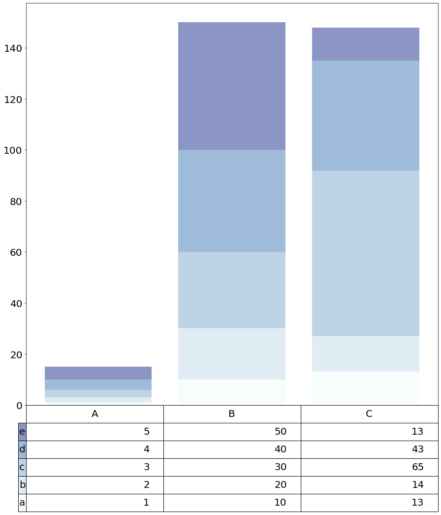
2. 참고
- How to change the table's fontsize with matplotlib.pyplot?
'ComputerLanguage_Program > PYTHON' 카테고리의 다른 글
| [PYTHON] matplotlib 으로 전단지 만들기 (0) | 2021.08.15 |
|---|---|
| [PYTHON] indicate_inset_zoom 을 이용한 줌 인 (0) | 2021.08.12 |
| [PYTHON] floweaver 를 이용한 sankey 그래프 그리기 (0) | 2021.08.10 |
| [PYTHON] fill_between 을 이용한 신뢰구간을 포함한 lineplot 구현하기 (0) | 2021.08.06 |
| [PYTHON] interpolate 로 violinplot 구현하기 (0) | 2021.08.05 |
'ComputerLanguage_Program/PYTHON' Related Articles
more


Comments