
| 일 | 월 | 화 | 수 | 목 | 금 | 토 |
|---|---|---|---|---|---|---|
| 1 | ||||||
| 2 | 3 | 4 | 5 | 6 | 7 | 8 |
| 9 | 10 | 11 | 12 | 13 | 14 | 15 |
| 16 | 17 | 18 | 19 | 20 | 21 | 22 |
| 23 | 24 | 25 | 26 | 27 | 28 |
- 매틀랩
- Blog
- 통계학
- 서평단
- Ga
- Tistory
- Visualization
- tensorflow
- Python
- python visualization
- 독후감
- 시각화
- 한빛미디어
- Google Analytics
- 텐서플로
- 블로그
- 리눅스
- Linux
- 파이썬 시각화
- 한빛미디어서평단
- 서평
- 딥러닝
- Pandas
- SQL
- 티스토리
- MATLAB
- 파이썬
- matplotlib
- 월간결산
- MySQL
- Today
- Total
목록seaborn (10)
pbj0812의 코딩 일기
 [PYTHON] 동일한 알파벳에 동일한 색을 매핑하여 파이차트 그리기
0. 목표 - 동일한 알파벳에 동일한 색을 매핑하여 파이차트 그리기 1. 실습 1) library 호출 import pandas as pd import matplotlib.pyplot as plt import numpy as np import seaborn as sns 2) 데이터 생성 df = pd.DataFrame({'category' : ['a', 'b', 'c', 'd', 'e', 'f'], 'num' : [1, 4, 7, 9, 3, 7]}) df2 = pd.DataFrame({'category' : ['e', 'g', 'c', 'b', 'a'], 'num' : [4, 2, 1, 6, 3]}) 3) 파이 차트 그리기 fig, ax = plt.subplots(1, 2) fig.set_size_inc..
 [PYTHON] GridSpec 을 이용한 여러 그래프를 같이 그리기
0. 목표 - GridSpec 을 이용한 여러 그래프를 같이 그리기 1. 실습 1) library 호출 import seaborn as sns import matplotlib.pyplot as plt from matplotlib import gridspec 2) 데이터 생성 flights_long = sns.load_dataset("flights") 3) heatmap 용 데이터 flights = flights_long.pivot("month", "year", "passengers") 4) barplot 용 데이터 year_df = flights_long.groupby(by = 'year').agg({'passengers' : 'sum'}) month_df = flights_long.groupby(by ..
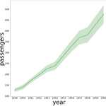 [PYTHON] fill_between 을 이용한 신뢰구간을 포함한 lineplot 구현하기
0. 목표 - fill_between 을 이용한 신뢰구간을 포함한 lineplot 구현하기 1. seaborn 의 lineplot import seaborn as sns flights = sns.load_dataset("flights") sns.lineplot(data=flights, x="year", y="passengers") 2. 구현하기 0) library 호출 import seaborn as sns import matplotlib.pyplot as plt import math 1) 데이터 확인 flights.head() 2) 변수 생성 - flights_mean : 연도별 탑승자 평균 - flights_year : 연도 - flights_len : 연도별 데이터 길이 flights_mean = ..
 [PYTHON] matplotlib 으로 FacetGrid 함수 구현하기
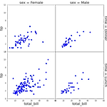
0. 목표 - matplotlib 으로 FacetGrid 구현하기 1. FacetGrid 예제 import seaborn as sns tips = sns.load_dataset("tips") g = sns.FacetGrid(tips, col="sex", row="time", margin_titles=True, despine=False) g.map_dataframe(sns.scatterplot, x="total_bill", y="tip") g.set_axis_labels("Total bill", "Tip") g.fig.subplots_adjust(wspace=0, hspace=0) 2. 실습 1) library 호출 import matplotlib.pyplot as plt 2) 함수 작성 (1) 도화지 분..
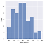 [PYTHON] displot, histplot 크기 조정하기
0. 목표 - displot, histplot 크기 조정하기 1. 실습 1) library 호출 - figure size 미리 조정 * seaborn version update 필요 : pip install seaborn==0.11.1 import matplotlib.pyplot as plt import seaborn as sns sns.set(rc={'figure.figsize':(15, 5)}) import pandas as pd 2) iris 데이터셋 로드 df = sns.load_dataset('iris') 3) distplot - 없어질거라고 한다. sns.distplot(df['sepal_length']) 4) histplot - 크기가 잘 맞춰 나온다. sns.histplot(df['sepa..
 [PYTHON] subplots 를 이용한 y축이 두 개인 그래프(plotyy) 그리기
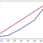
0. 목표 - subplots 를 이용한 y 축이 두 개인 그래프(plotyy) 그리기 1. 실습 1) matplotlib 으로 그리기 (1) library 호출 import matplotlib.pyplot as plt (2) 데이터 생성 x1 = [1, 2, 3, 4, 5] y1 = [1, 2, 3, 4, 5] x2 = [1, 2, 3, 4, 5] y2 = [1, 10, 50, 100, 200] (3) subplots 생성 fig, axe1 = plt.subplots() (4) ax 복사 axe2 = axe1.twinx() (5) 그래프 그리기 c1 = axe1.plot(x1, y1, color = 'r') c2 = axe2.plot(x2, y2, color = 'b') axe1.set_ylabel('..
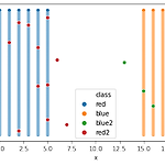 [Machine Learning] KNN 으로 편가르기
0. 목표 - KNN 으로 편가르기 1. 실습 1) 데이터 생성 - 두 팀 생성 import numpy as np x = np.linspace(0, 5, 6) y = np.linspace(0, 100, 101) xx, yy = np.meshgrid(x, y) xxx = np.reshape(xx, (-1, )) yyy = np.reshape(yy, (-1, )) x2 = np.linspace(15, 20, 6) y2 = np.linspace(0, 100, 101) xx2, yy2 = np.meshgrid(x2, y2) xxx2 = np.reshape(xx2, (-1, )) yyy2 = np.reshape(yy2, (-1, )) 2) 데이터 프레임화 import pandas as pd df = pd.Data..
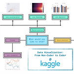 [kaggle] Data Visualization 수료과정
0. 목차 및 내용 1) Hello, Seaborn - notebook 설명, csv 읽기, lineplot plt.figure(figsize=(16,6)) sns.lineplot(data=fifa_data) 2) Line Charts - title, xlabel, label plt.figure(figsize=(14,6)) plt.title("Daily Global Streams of Popular Songs in 2017-2018") sns.lineplot(data=spotify_data['Shape of You'], label="Shape of You") sns.lineplot(data=spotify_data['Despacito'], label="Despacito") plt.xlabel("Date")..
 [통계학] python을 이용한 블로그 방문자수 회귀선 그리기
* 주의 : 이 데이터는 회귀를 사용하기에는 좋은 데이터가 아닙니다!!! 0. 목표 - python을 이용한 내 블로그 방문자 수 회귀선 그리기 - Y = a + bX (링크) 1. 실습 1) library 호출 import matplotlib.pyplot as plt 2) 데이터 생성 - y : 블로그를 다시 쓰기 시작한 2019년 2월 부터의 방문자수를 사용 - x : 2019년 2월을 1로 두고 1씩 증가하는 형태 y = [98, 221, 221, 419, 440, 451, 531, 523, 699, 612, 977, 1002, 1263, 1531, 2174, 3320, 3758, 5161] x = [i for i in range(1, len(y) + 1)] 3) 데이터 확인 plt.bar(x, y..