
Notice
Recent Posts
Recent Comments
Link
| 일 | 월 | 화 | 수 | 목 | 금 | 토 |
|---|---|---|---|---|---|---|
| 1 | 2 | 3 | 4 | 5 | 6 | 7 |
| 8 | 9 | 10 | 11 | 12 | 13 | 14 |
| 15 | 16 | 17 | 18 | 19 | 20 | 21 |
| 22 | 23 | 24 | 25 | 26 | 27 | 28 |
Tags
- Pandas
- Visualization
- matplotlib
- 티스토리
- 서평단
- Python
- 텐서플로
- Ga
- SQL
- 파이썬
- MySQL
- 파이썬 시각화
- Blog
- Linux
- 통계학
- tensorflow
- 블로그
- 리눅스
- 서평
- 월간결산
- 한빛미디어
- MATLAB
- 매틀랩
- 딥러닝
- Google Analytics
- Tistory
- 독후감
- python visualization
- 시각화
- 한빛미디어서평단
Archives
- Today
- Total
pbj0812의 코딩 일기
[Python] barh 그래프에서 특정 bar만 다른 색으로 칠하기 본문
0. 목표
- barh 그래프에서 특정 bar만 다른 색으로 칠하기
1. 실습
1) library 호출
import pandas as pd
import matplotlib.pyplot as plt
2) 데이터 생성
df = pd.DataFrame({'catn' : ['a', 'b', 'c', 'd', 'e'],
			'2020' : [1, 2, 3, 4, 5],
                    '2021' : [5, 4, 3, 2, 1],
                    '2022' : [3, 5, 1, 5, 2]})
df_copy = df.copy()
3) 그림 제작에 사용될 필드명 저장
column_list = df_copy.columns[1:]
4) 그림 그리기
# 판 깔기
fig, ax = plt.subplots(len(column_list), 1)
# 피규어 크기 조정
fig.set_size_inches(15, 10 * len(column_list))
for i in range(len(column_list)):
    # 필드 명 기준 정렬
    df_copy.sort_values(column_list[i], ascending = True, inplace = True)
    # 인덱스 초기화(찾고자 하는 조건의 인덱스 위치 찾기 위함)
    df_copy.reset_index(drop= True, inplace = True)
    # barh
    bars = ax[i].barh(df_copy['catn'], df_copy[column_list[i]], color = 'blue')
    # 특정 레코드 명 필드만 특정색으로 칠하기
    bars[df_copy[df_copy['catn']=='a'].index[0]].set_color('orange')
    # 꾸미기
    ax[i].set_title(column_list[i], fontsize = 20)
    ax[i].tick_params(axis = 'x', labelsize = 15)
    ax[i].tick_params(axis = 'y', labelsize = 15)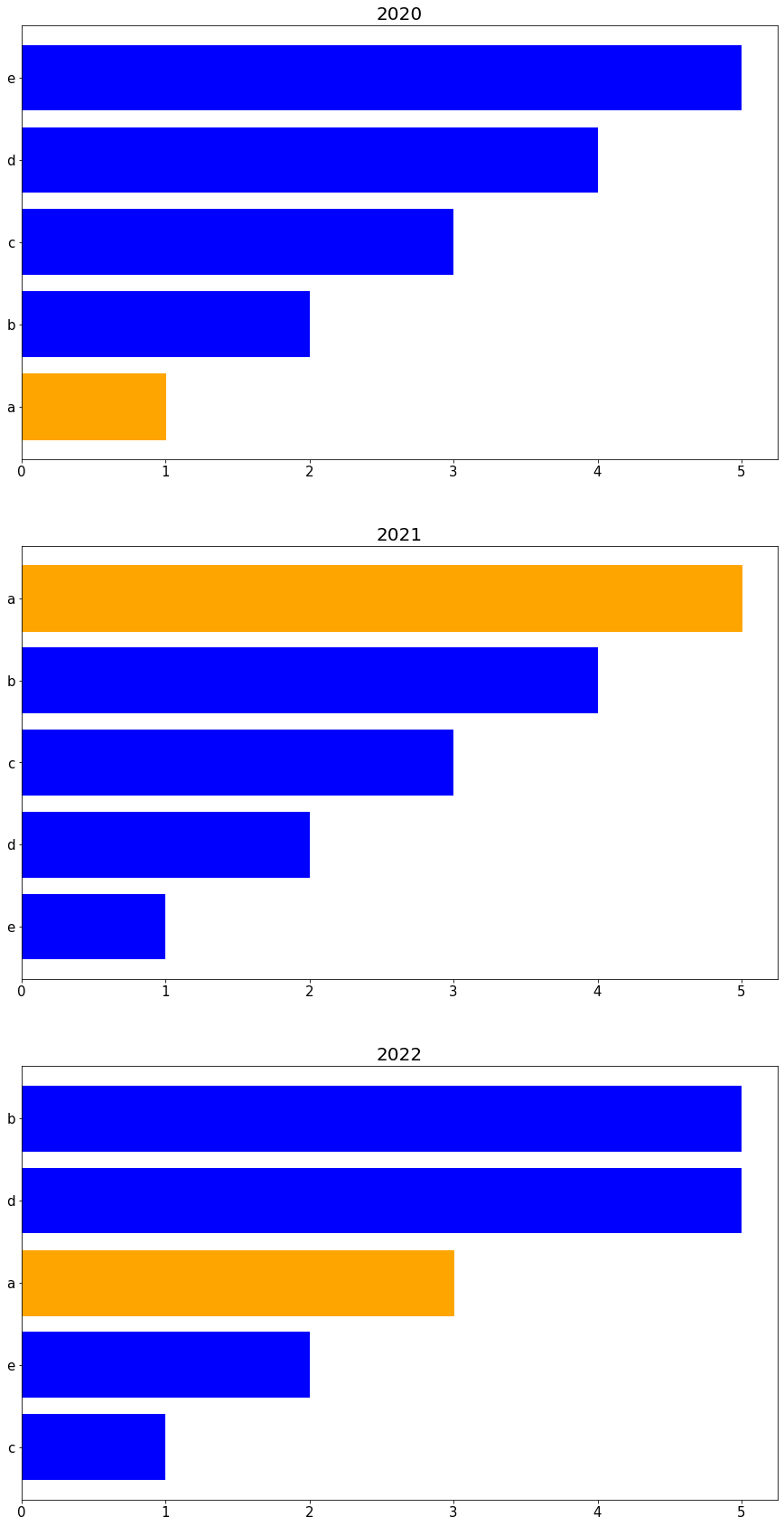
2. 참고
- python - Matplotlib에서 단일 막대 업데이트
'ComputerLanguage_Program > PYTHON' 카테고리의 다른 글
| [PYTHON] 동일한 알파벳에 동일한 색을 매핑하여 파이차트 그리기 (0) | 2022.01.07 |
|---|---|
| [PYTHON] 특정 그룹에 해당하는 bar 들만 색칠하기 (0) | 2022.01.05 |
| [PYTHON] 정해진 구역에 패턴 채우기 (0) | 2021.12.19 |
| [PYTHON] 국내 프로야구 역대 관중 수 그리기 (0) | 2021.12.17 |
| [PYTHON] minor 기능을 이용한 보조 눈금 그리기 (0) | 2021.12.16 |
'ComputerLanguage_Program/PYTHON' Related Articles
more


Comments