
Notice
Recent Posts
Recent Comments
Link
| 일 | 월 | 화 | 수 | 목 | 금 | 토 |
|---|---|---|---|---|---|---|
| 1 | 2 | 3 | 4 | 5 | 6 | 7 |
| 8 | 9 | 10 | 11 | 12 | 13 | 14 |
| 15 | 16 | 17 | 18 | 19 | 20 | 21 |
| 22 | 23 | 24 | 25 | 26 | 27 | 28 |
Tags
- Pandas
- 한빛미디어
- 티스토리
- 리눅스
- 텐서플로
- MATLAB
- 통계학
- Tistory
- 파이썬 시각화
- 파이썬
- Python
- 독후감
- MySQL
- Linux
- matplotlib
- tensorflow
- 월간결산
- 블로그
- Visualization
- 매틀랩
- 딥러닝
- python visualization
- 서평단
- Ga
- SQL
- 서평
- Google Analytics
- 시각화
- 한빛미디어서평단
- Blog
Archives
- Today
- Total
pbj0812의 코딩 일기
[PYTHON] matplotlib 으로 seaboard scatterplot 구현하기 본문
ComputerLanguage_Program/PYTHON
[PYTHON] matplotlib 으로 seaboard scatterplot 구현하기
pbj0812 2021. 12. 14. 00:330. 목표
- matplotlib 으로 seaborn scatterplot 구현하기
1. 실습
1) library 호출
import pandas as pd
import matplotlib.pyplot as plt
import seaborn as sns
2) 데이터 호출
df = sns.load_dataset('tips')3) seaborn 으로 그리기
sns.scatterplot(x = 'total_bill', y = 'tip', hue = 'size', style = 'sex', palette = 'Blues', data = df)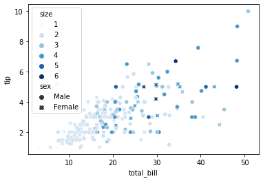
4) matplotlib 으로 그리기
(1) 색깔만 바꾸기
fig, ax = plt.subplots()
scatter = ax.scatter(df['total_bill'], df['tip'], c = df['size'], cmap = 'Blues')
legend1 = ax.legend(*scatter.legend_elements(num = len(df['size'].unique())), loc="upper left", title = "size")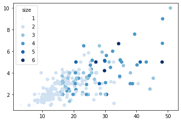
(2) 모양 바꾸기
fig, ax = plt.subplots()
ax.scatter(b[0]['total_bill'], b[0]['tip'], marker = 'x', label = 'F')
ax.scatter(b[1]['total_bill'], b[1]['tip'], marker = 'o',  label = 'M')
ax.legend(title = 'sex')
(3) 색 + 모양 바꾸기
fig, ax = plt.subplots()
df2 = df.groupby('sex')
marker = ['x', 'o']
tmp = 0
for name, group in df2:
    scatter = ax.scatter(group['total_bill'], group['tip'], marker = marker[tmp], c = group['size'], cmap = 'Blues')
    legend1 = ax.legend(*scatter.legend_elements(num = len(group['size'].unique())), loc="upper left", title = "size")
    tmp += 1
2. 참고
'ComputerLanguage_Program > PYTHON' 카테고리의 다른 글
| [PYTHON] 국내 프로야구 역대 관중 수 그리기 (0) | 2021.12.17 |
|---|---|
| [PYTHON] minor 기능을 이용한 보조 눈금 그리기 (0) | 2021.12.16 |
| [PYTHON] 인덱싱, 슬라이싱, iloc, loc, iat, at 정리 (0) | 2021.11.15 |
| [PYTHON] 구글 스프레드 시트 데이터를 mysql 에 저장하기 (0) | 2021.10.21 |
| [PYTHON] OpenCV 를 이용한 얼굴 비율 산출기 제작 (0) | 2021.09.10 |
'ComputerLanguage_Program/PYTHON' Related Articles
more


Comments