
Notice
Recent Posts
Recent Comments
Link
| 일 | 월 | 화 | 수 | 목 | 금 | 토 |
|---|---|---|---|---|---|---|
| 1 | 2 | 3 | 4 | 5 | 6 | 7 |
| 8 | 9 | 10 | 11 | 12 | 13 | 14 |
| 15 | 16 | 17 | 18 | 19 | 20 | 21 |
| 22 | 23 | 24 | 25 | 26 | 27 | 28 |
Tags
- 파이썬
- 월간결산
- matplotlib
- tensorflow
- 통계학
- MySQL
- 매틀랩
- Google Analytics
- 서평단
- 한빛미디어
- Ga
- 서평
- python visualization
- 텐서플로
- 독후감
- MATLAB
- Tistory
- 딥러닝
- Blog
- SQL
- 시각화
- 블로그
- 리눅스
- 파이썬 시각화
- Linux
- 한빛미디어서평단
- Visualization
- Python
- Pandas
- 티스토리
Archives
- Today
- Total
pbj0812의 코딩 일기
[PYTHON] bar 그래프에 백분율 표시하기 본문
0. 목표
- bar 그래프에 백분율 표시하기
1. 실습
1) library 호출
import pandas as pd
import matplotlib.pyplot as plt
2) 데이터 프레임 생성
df = pd.DataFrame({'date' : ['2017', '2018', '2019', '2020'], 'A' : [150, 200, 225, 270], 'B' : [30, 45, 52, 60]})

df['total'] = df['A'] + df['B']
df['A_percent'] = round(df['A'] / df['total'] * 100, 1)
df['B_percent'] = round(100 - df['A_percent'], 1)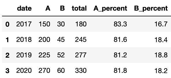
3) 그림 그리기
fig, ax = plt.subplots()
# 피규어 크기
fig.set_size_inches(15, 10)
# 그래프 뒤에 그리드 그리기
ax.set_axisbelow(True)
# y 축만 그리드 그리기
ax.grid(True, axis='y')
# bar 그리기
ax.bar(df['date'], df['A'], label = 'A', color = '#0599e8')
ax.bar(df['date'], df['B'], bottom = df['A'], label = 'B', color = '#fc4e03')
# 라벨 설정
ax.set_xlabel('year', fontsize = 25)
ax.set_ylabel('revenue', fontsize = 25)
# tick 설정
ax.tick_params(axis = 'x', labelsize = 20)
ax.tick_params(axis = 'y', labelsize = 20)
# 범례 표시
ax.legend(fontsize = 25)

# 텍스트 지정
for i in range(len(df['date'])):
    ax.text(df['date'][i], df['A'][i] / 2, str(df['A_percent'][i]) + '%', fontsize = 20, horizontalalignment='center', color = 'w')
    ax.text(df['date'][i], (df['A'][i] + df['A'][i] + df['B'][i])/ 2, str(df['B_percent'][i]) + '%', fontsize = 20, horizontalalignment='center', color = 'w')
- 결과

2. 참고
- Matplotlib 에서 눈금 레이블 글꼴 크기를 설정하는 방법
'ComputerLanguage_Program > PYTHON' 카테고리의 다른 글
| [PYTHON] offsetbox 를 이용한 피카츄(이미지) 산점도 그리기 (0) | 2021.07.30 |
|---|---|
| [PYTHON] matplotlib 의 barh 로 분수 표현하기 (0) | 2021.07.28 |
| [PYTHON] streamlit 으로 대시보드 만들기 (0) | 2021.07.21 |
| [PYTHON] stackplot 으로 Age Of Empires 그래프 그리기 (0) | 2021.07.18 |
| [PYTHON] pandas-bokeh 라이브러리 써보기 (0) | 2021.07.16 |
'ComputerLanguage_Program/PYTHON' Related Articles
more


Comments