ComputerLanguage_Program/PYTHON
[PYTHON] plotly 를 이용하여 sankey diagram 그리기(+ 색상 추가)
pbj0812
2023. 10. 19. 02:42
0. 목표
- plotly 를 이용하여 sankey diagram 그리기(+ 색상 추가)
1. 실습
1) library 호출
import plotly.graph_objects as go
import pandas as pd
import matplotlib.colors as mcolors
2) 데이터 생성
df = pd.DataFrame({
    'source' : ['A1', 'A1', 'A2', 'B1', 'B2'],
    'target' : ['B1', 'B2', 'B2', 'C1', 'C1'],
    'value' : [8, 2, 4, 8, 4]
})
3) 라벨 만들기
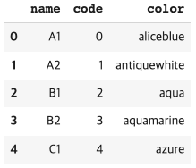
label = pd.DataFrame({
    'name' : ['A1', 'A2', 'B1', 'B2', 'C1'],
    'code' : [0, 1, 2, 3, 4]
})
4) 색상 추가
- mcolors 에서 제공해주는 색상 정보를(dict 형태) list 형태로 변환하여 키 값만 가져온 뒤 라벨의 개수에 맞게 매핑(알파벳 순으로 매핑됨)
label['color'] = list(mcolors.CSS4_COLORS)[:len(label)]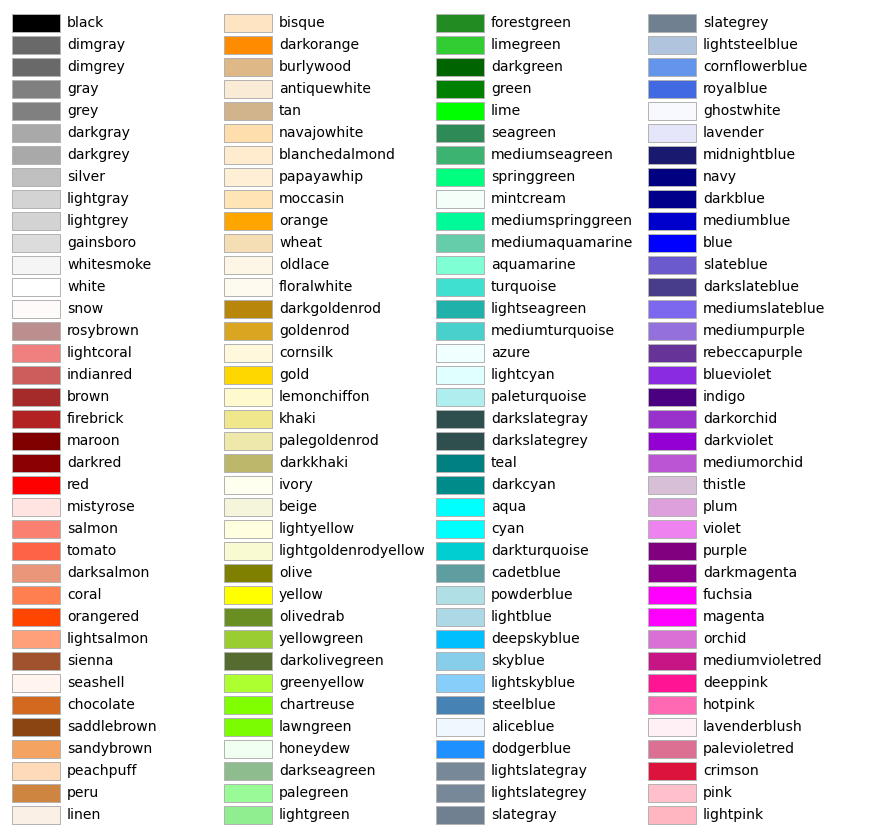
5) 데이터에 매핑
dict_sido = label.set_index('name')['code'].to_dict()
dict_sido2 = label.set_index('name')['color'].to_dict()

df['source2'] = df['source'].map(dict_sido)
df['target2'] = df['target'].map(dict_sido)
df['color2'] = df['source'].map(dict_sido2)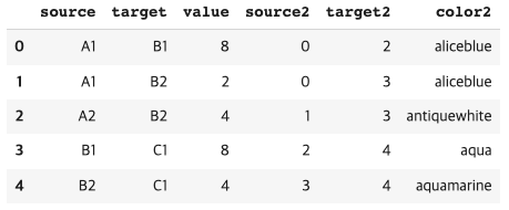
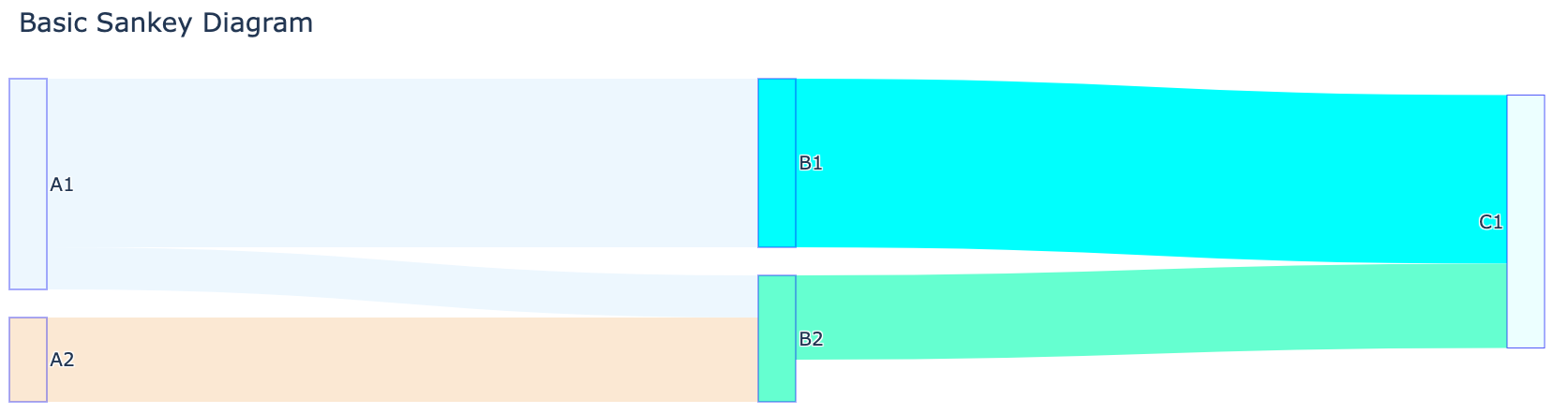
6) 그림 그리기
fig = go.Figure(data=[go.Sankey(
    node = dict(
      pad = 30, # 바 사이의 간격
      thickness = 40, # 바의 굵기
      line = dict(color = "blue", width = 0.5), # 선 관리
      label = ["A1", "A2", "B1", "B2", "C1"],
      color = label['color'] # 바 색상
    ),
    link = dict(
      source = df['source2'], # 어디에서, 0 : A1, 2 : A2
      target = df['target2'], # 어디로
      value = df['value'], # 얼만큼 보내는가
      color = df['color2'] # line 색상
  ))])

fig.update_layout(title_text="Basic Sankey Diagram", font_size=20)
fig.show()
2. 결과
3. 참고 문헌
Sankey
Detailed examples of Sankey Diagram including changing color, size, log axes, and more in Python.
plotly.com
List of named colors — Matplotlib 3.8.0 documentation
List of named colors This plots a list of the named colors supported in matplotlib. For more information on colors in matplotlib see Helper Function for Plotting First we define a helper function for making a table of colors, then we use it on some common
matplotlib.org