인공지능 & 머신러닝/kaggle
[kaggle] Data Visualization 수료과정
pbj0812
2021. 4. 29. 00:52
0. 목차 및 내용
1) Hello, Seaborn
- notebook 설명, csv 읽기, lineplot
plt.figure(figsize=(16,6))
sns.lineplot(data=fifa_data)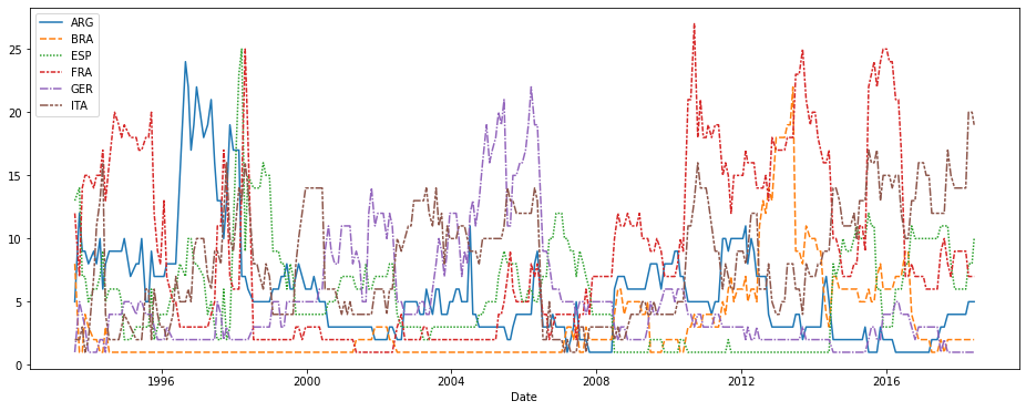
2) Line Charts
- title, xlabel, label
plt.figure(figsize=(14,6))
plt.title("Daily Global Streams of Popular Songs in 2017-2018")
sns.lineplot(data=spotify_data['Shape of You'], label="Shape of You")
sns.lineplot(data=spotify_data['Despacito'], label="Despacito")
plt.xlabel("Date")
3) Bar Charts and Heatmaps
- barplot, heatmap
plt.figure(figsize=(10,6))
plt.title("Average Arrival Delay for Spirit Airlines Flights, by Month")
sns.barplot(x=flight_data.index, y=flight_data['NK'])
plt.ylabel("Arrival delay (in minutes)")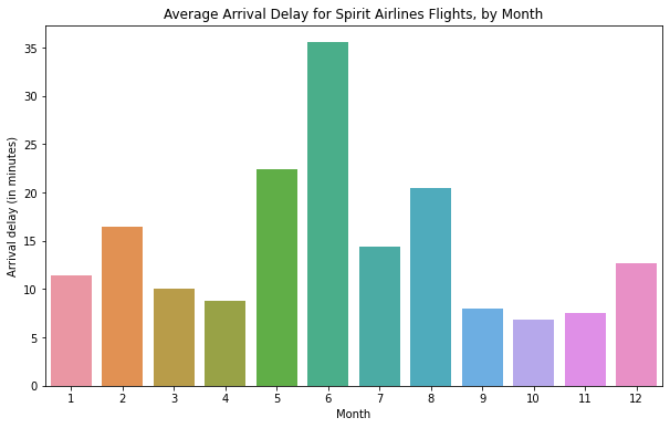
plt.figure(figsize=(14,7))
plt.title("Average Arrival Delay for Each Airline, by Month")
sns.heatmap(data=flight_data, annot=True)
plt.xlabel("Airline")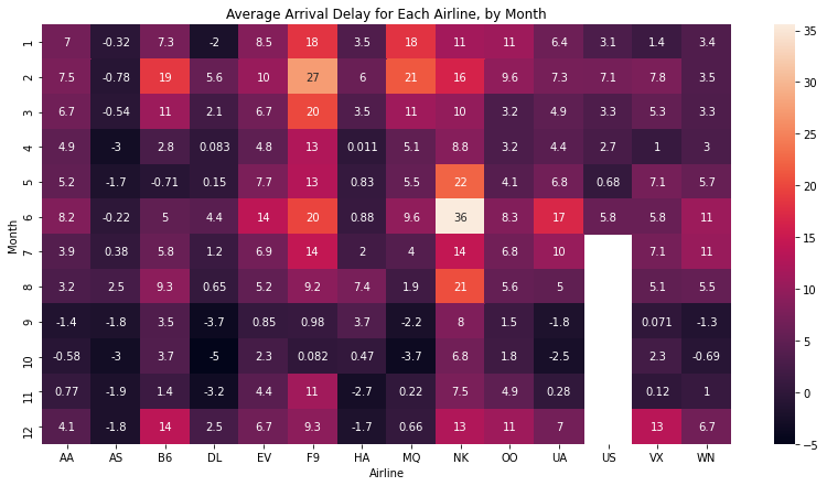
4) Scatter Plots
- scatterplot, regplot, lmplot, swarmplot
sns.scatterplot(x=insurance_data['bmi'], y=insurance_data['charges'], hue=insurance_data['smoker'])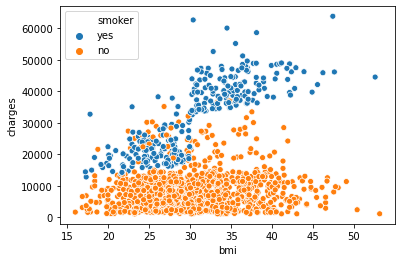
sns.regplot(x=insurance_data['bmi'], y=insurance_data['charges'])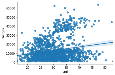
sns.lmplot(x="bmi", y="charges", hue="smoker", data=insurance_data)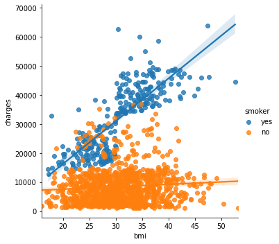
sns.swarmplot(x=insurance_data['smoker'], y=insurance_data['charges'])
5) Distributions
- distplot, kdeplot, jointplot
sns.distplot(a=iris_data['Petal Length (cm)'], kde=False)
sns.kdeplot(data=iris_data['Petal Length (cm)'], shade=True)
sns.jointplot(x=iris_data['Petal Length (cm)'], y=iris_data['Sepal Width (cm)'], kind="kde")
6) Choosing Plot Types and Custom Styles
- 상황에 따른 플롯 설정, set을 이용한 그래프 수정

7) Final Project
- 캐글에서 데이터 추가하는 방법
8) Creating Your Own Notebooks
- 캐글시작하기
1. 수료증
